Between Capture and Creation
Medium: Digital Collage (photography + photoshop composite)
This piece acts as a reconstructed world, representing a visual narrative built from fragments of real moments, real spaces, and real images. This piece represents how I move between mediums (capturing, editing, designing, and constructing) to create visual stories that are immersive, human, and intentional.
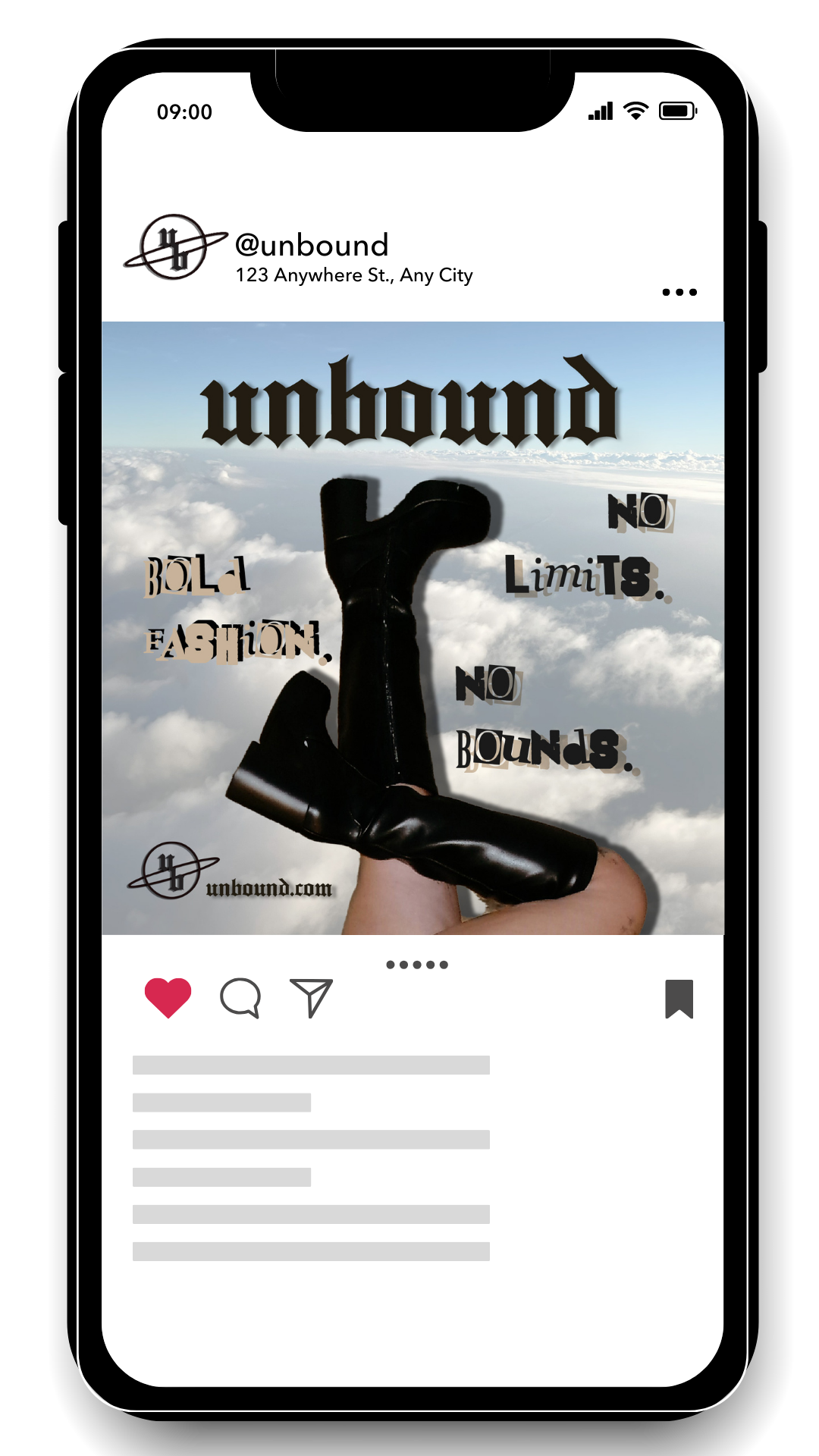
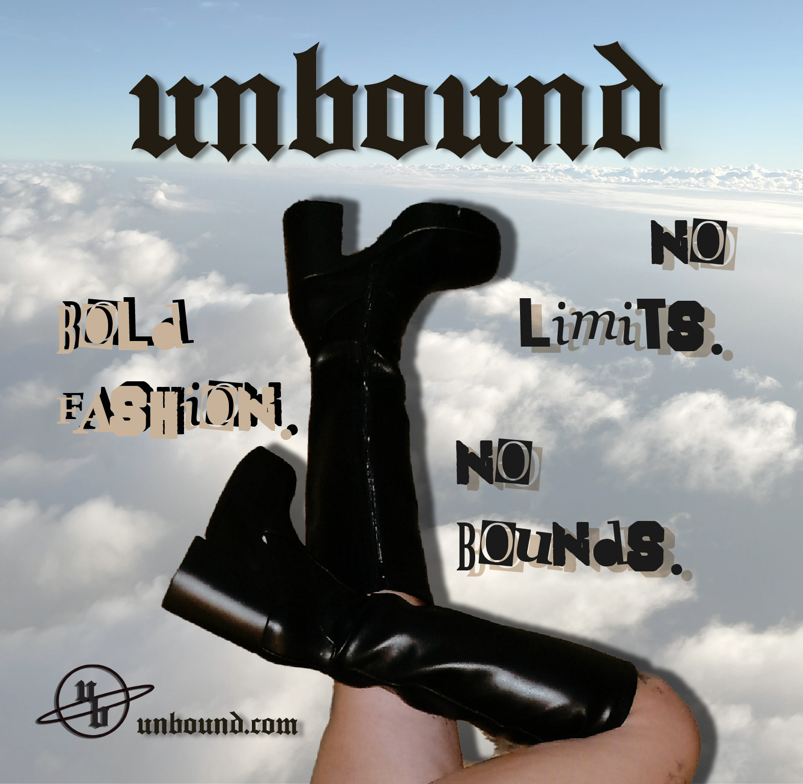
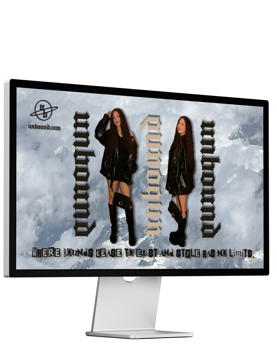
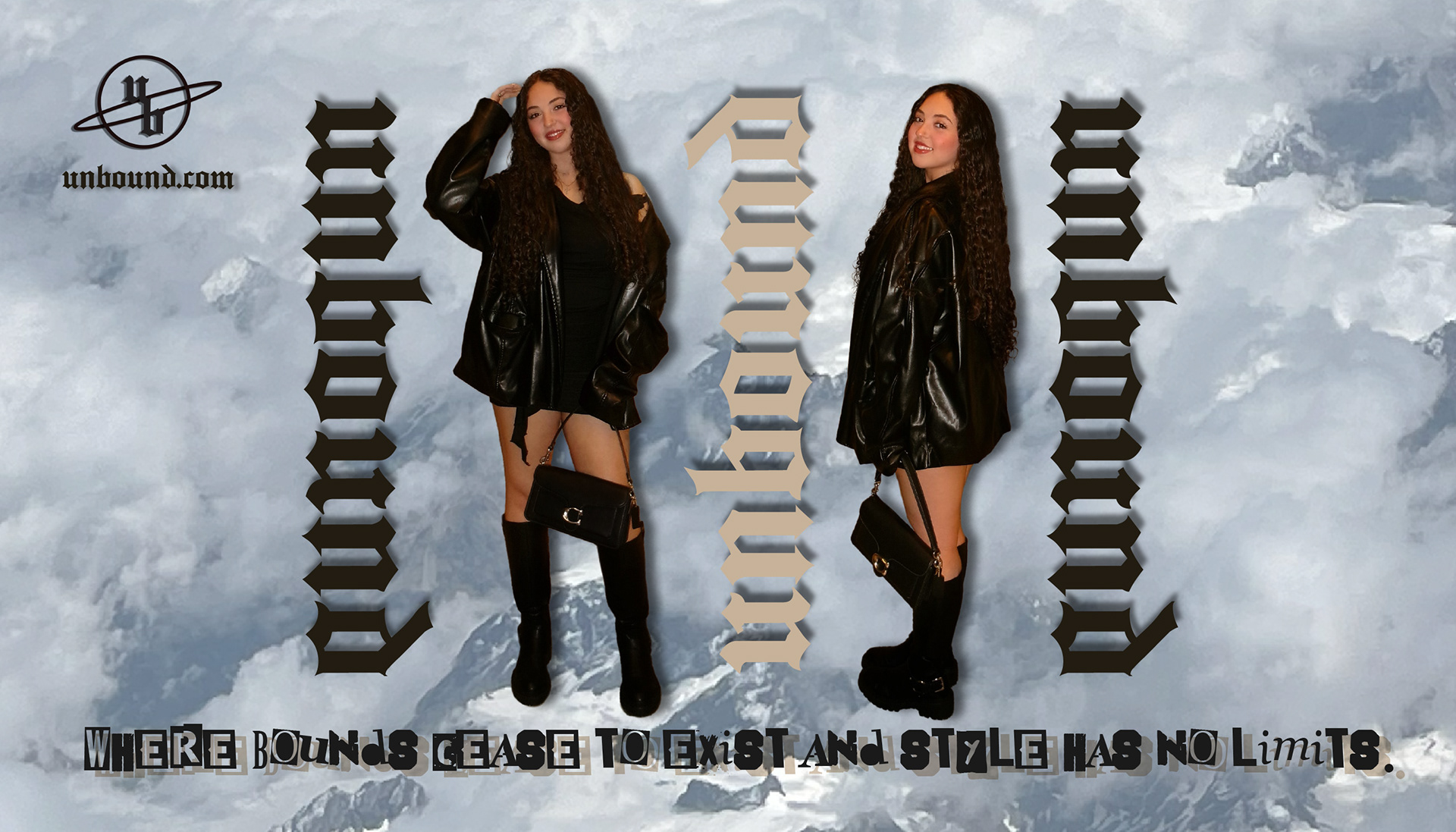
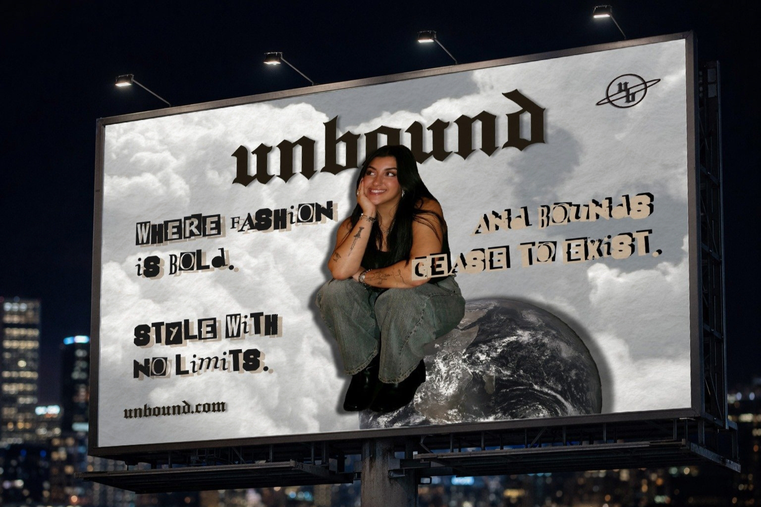
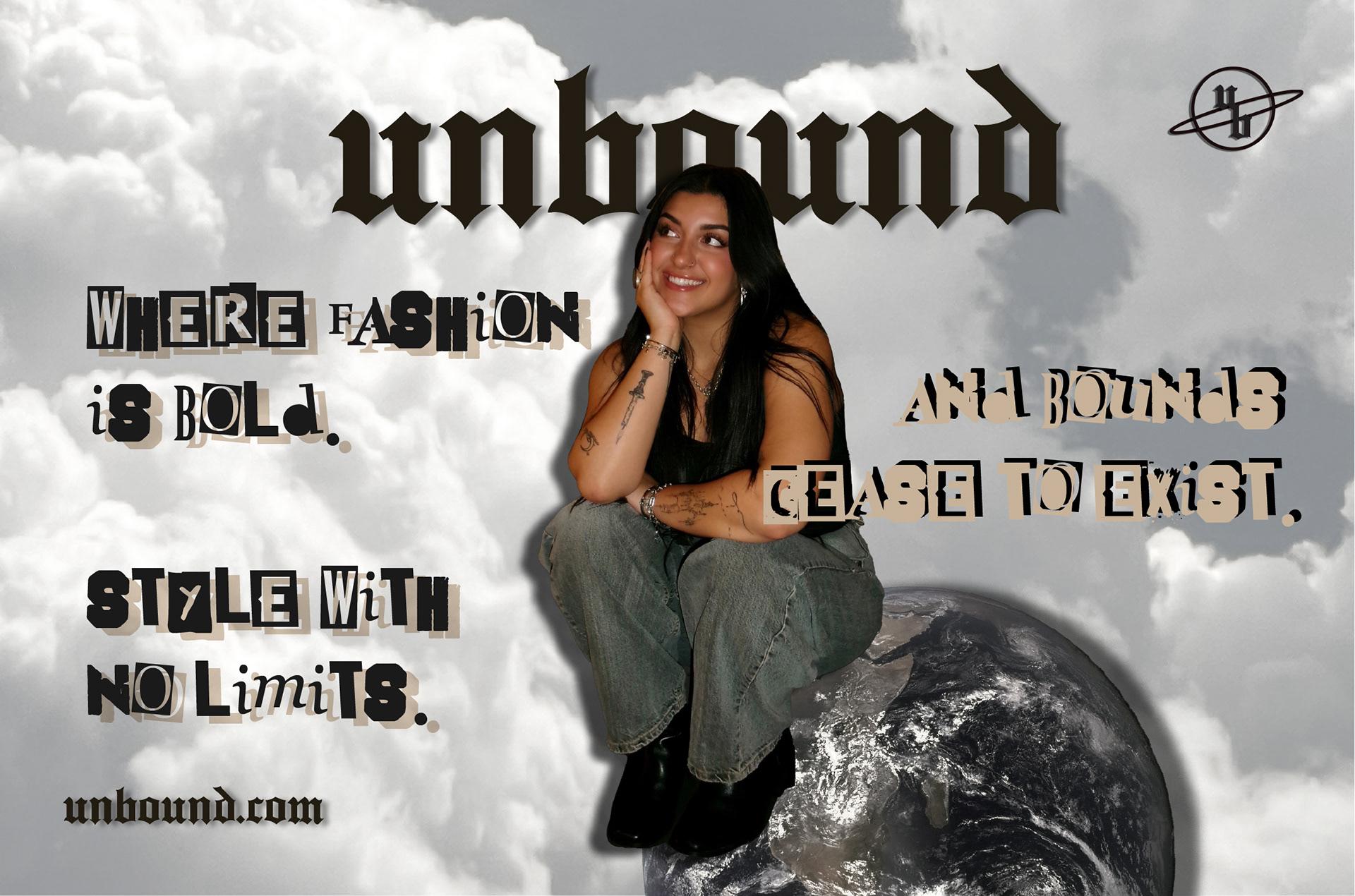
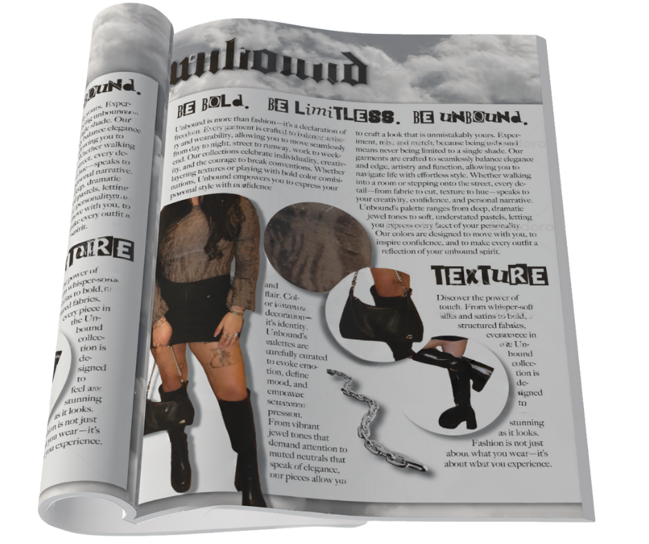
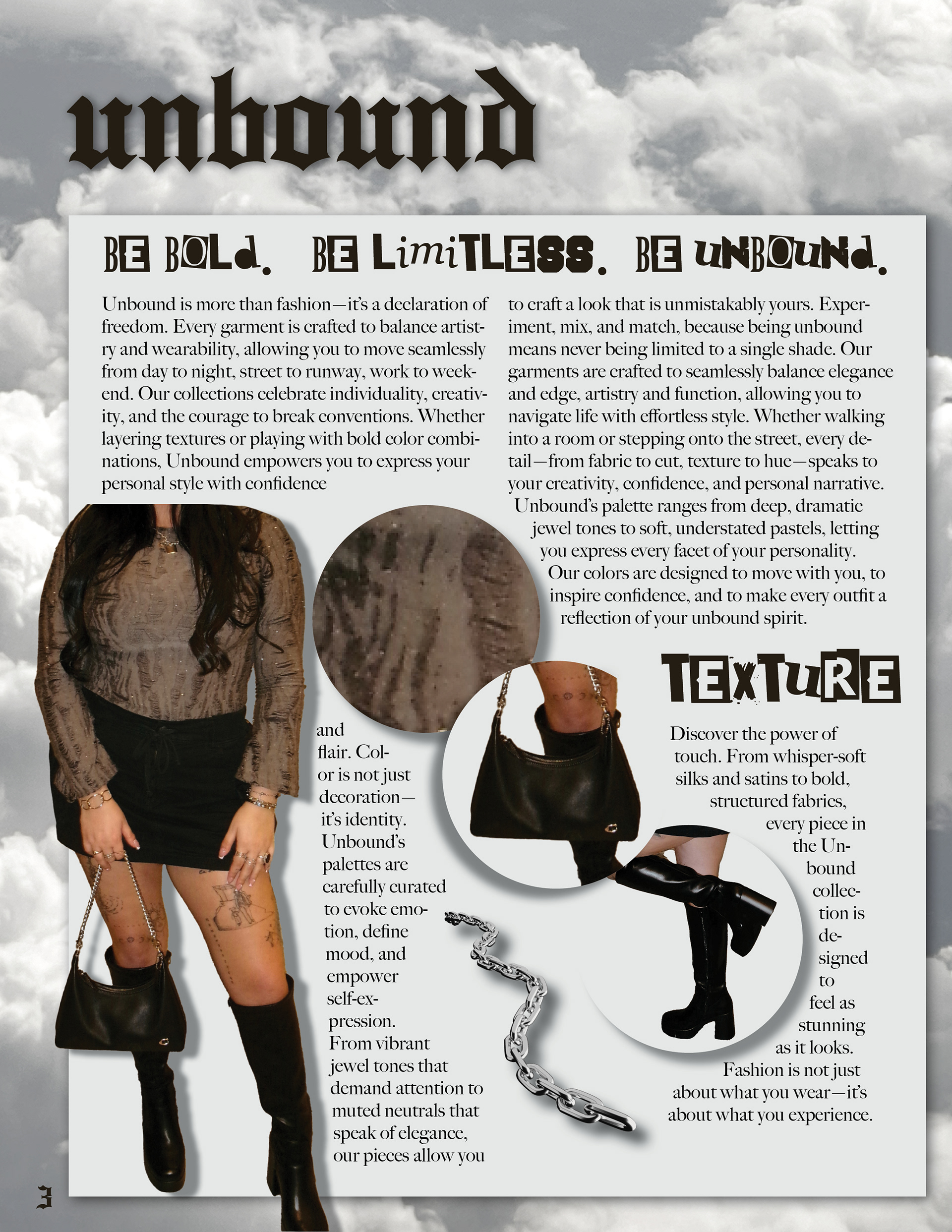
FASHION branding: unbound
Medium: Adobe photoshop, lightroom, and indesign
I created a fashion brand called Unbound and developed branding elements as part of an advertising campaign.
1. nstagram square ad
2. facebook ad
3. billboard ad
4. full MAGAZINE page ad
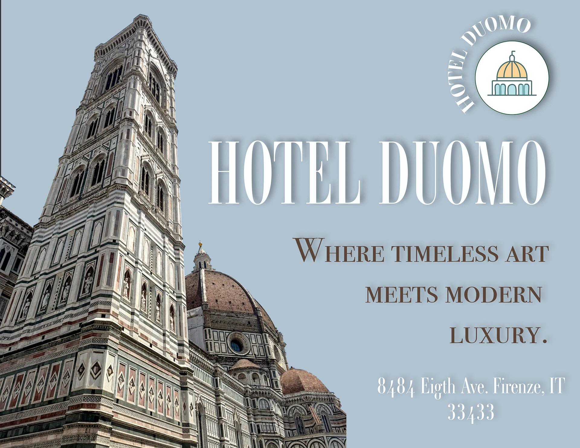
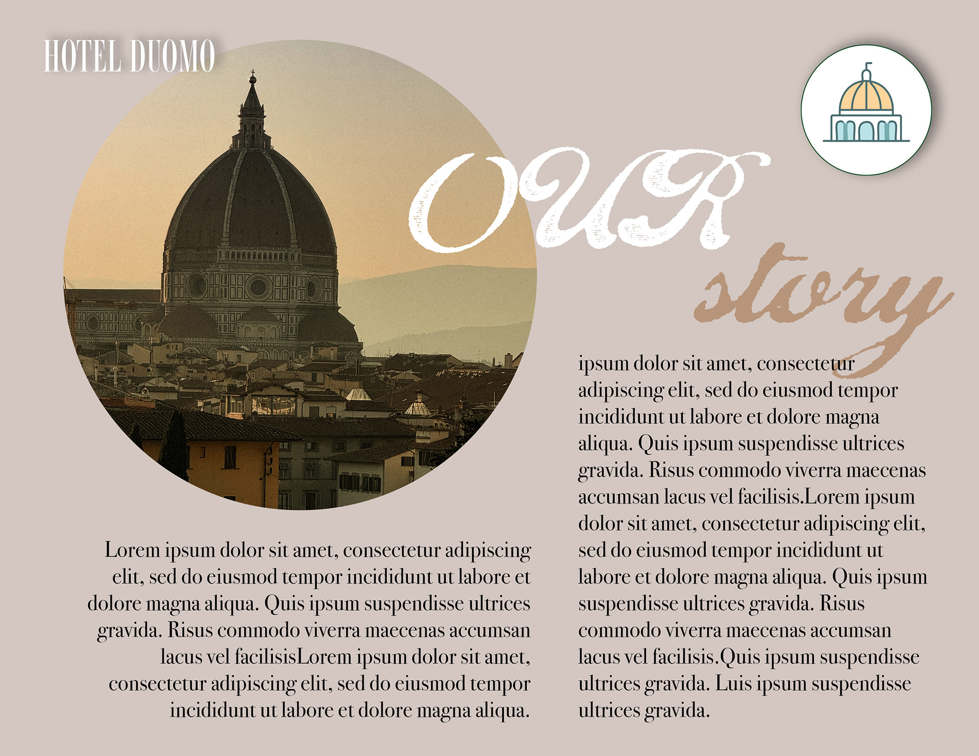
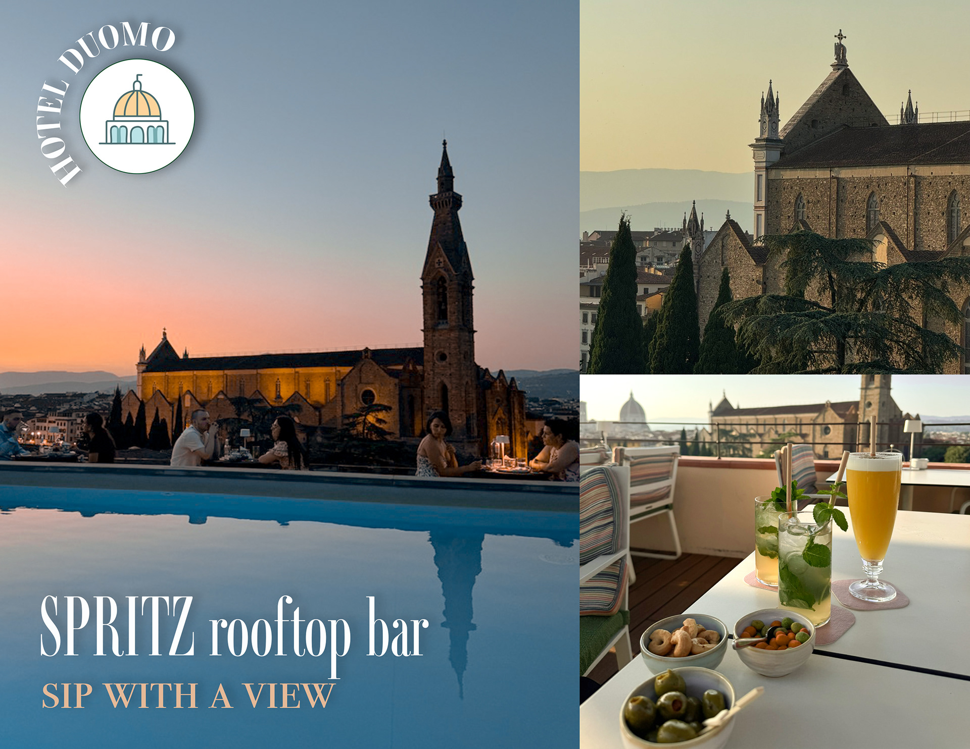
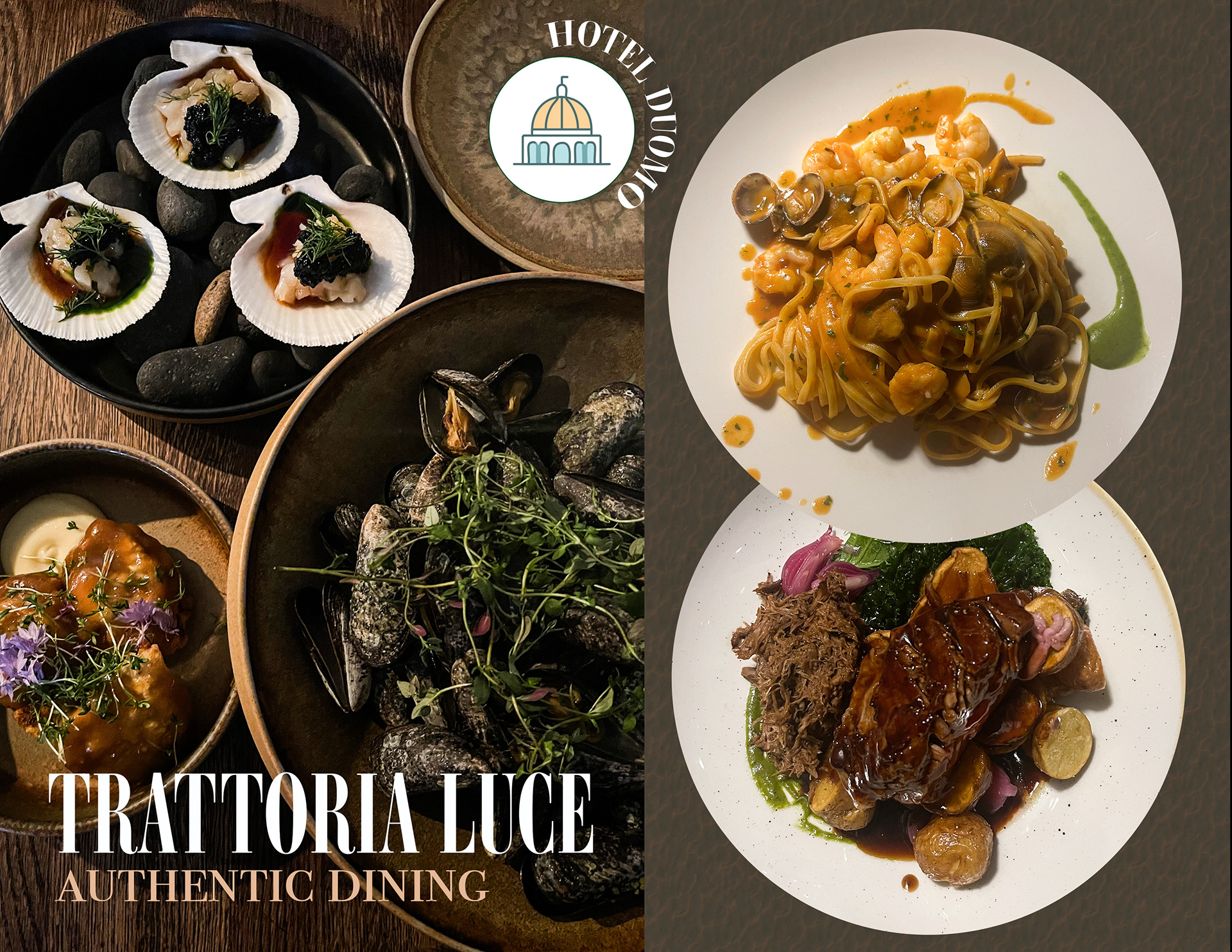
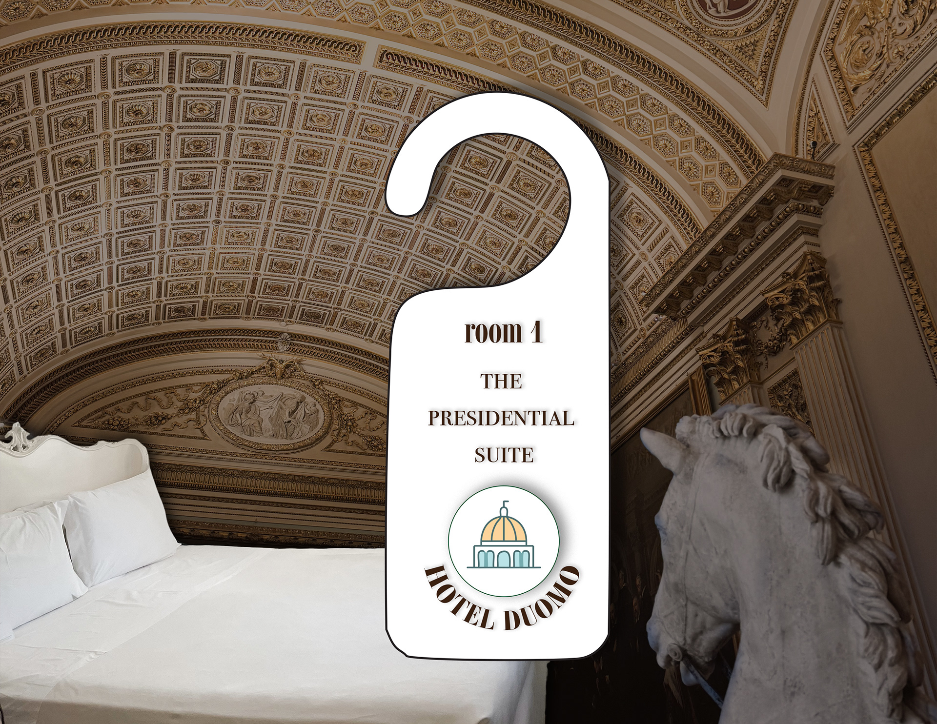
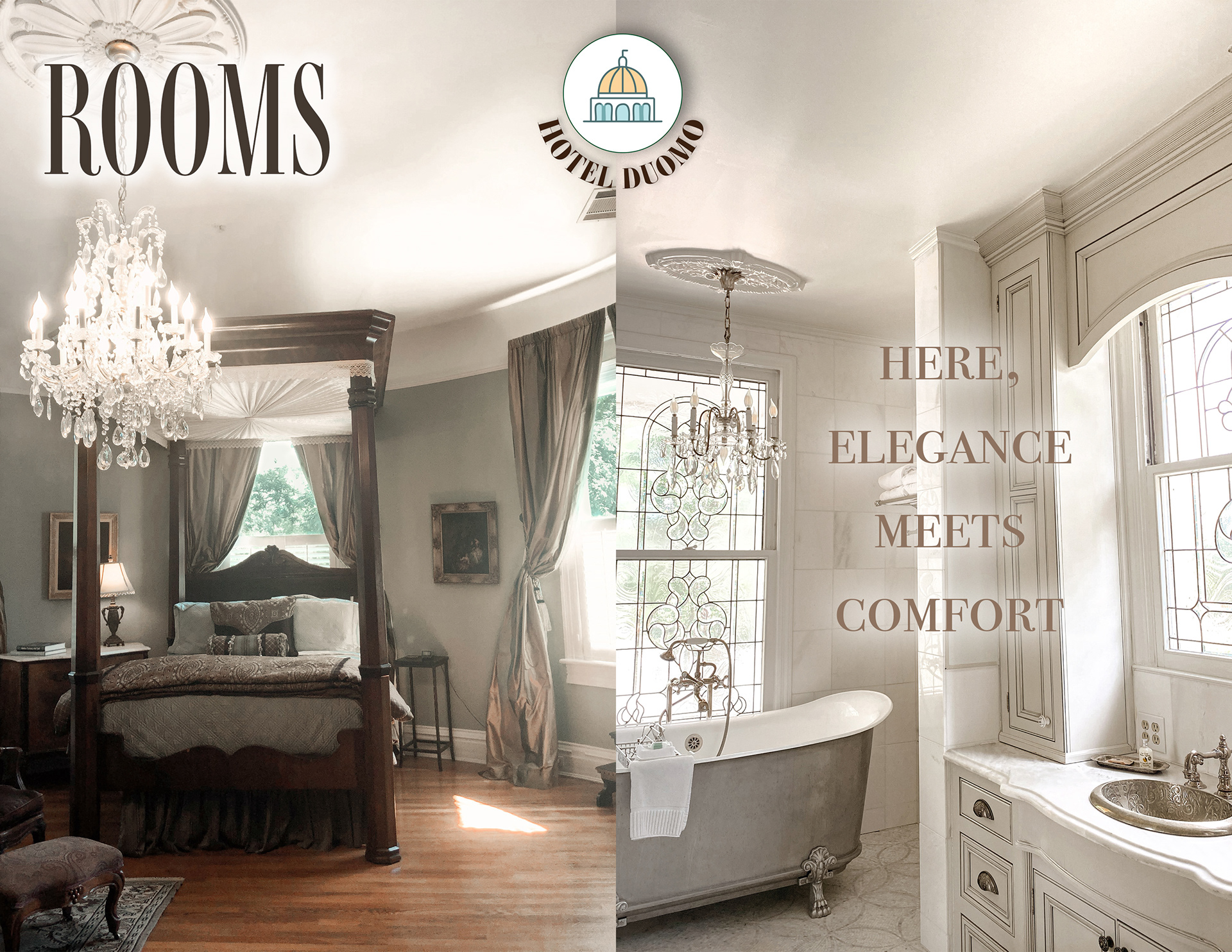
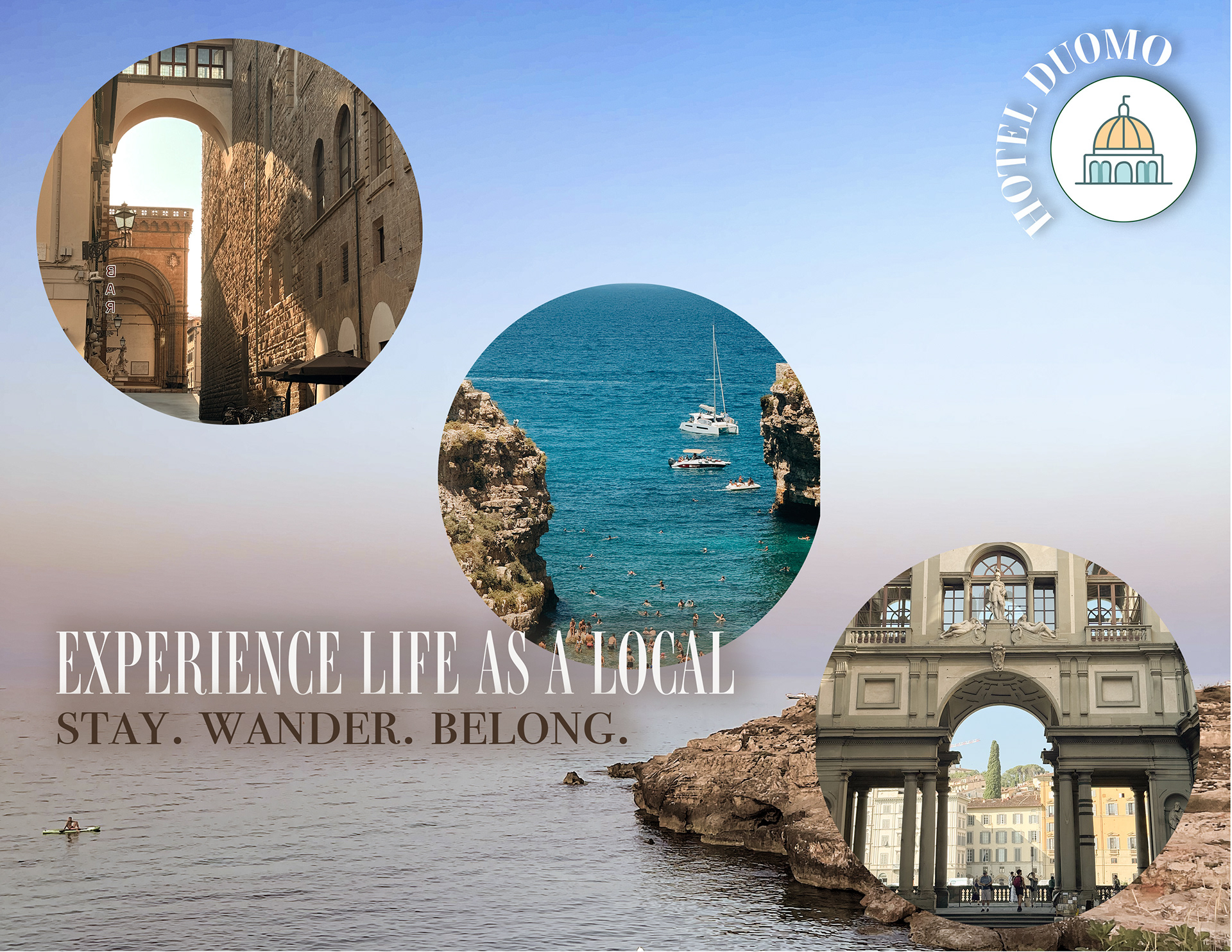
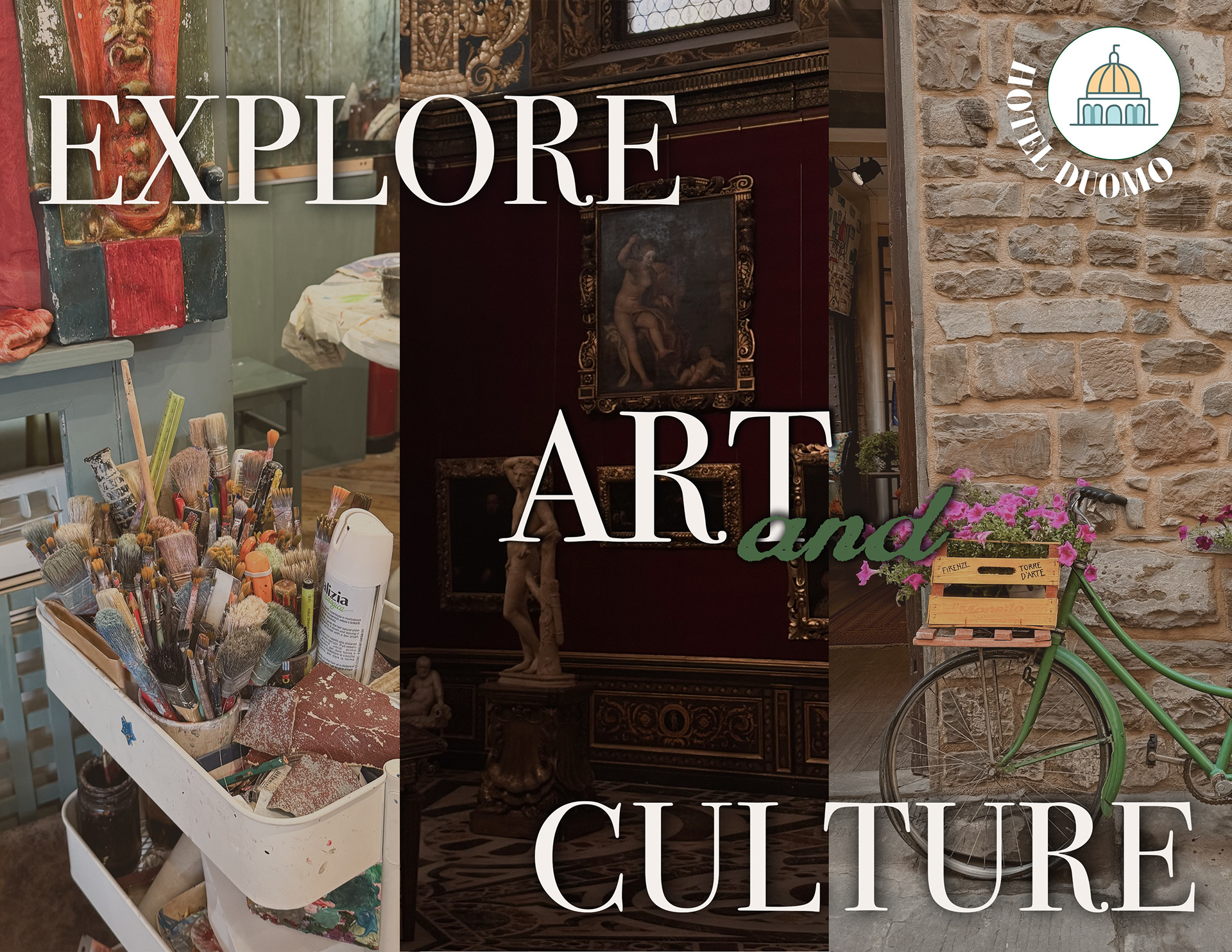
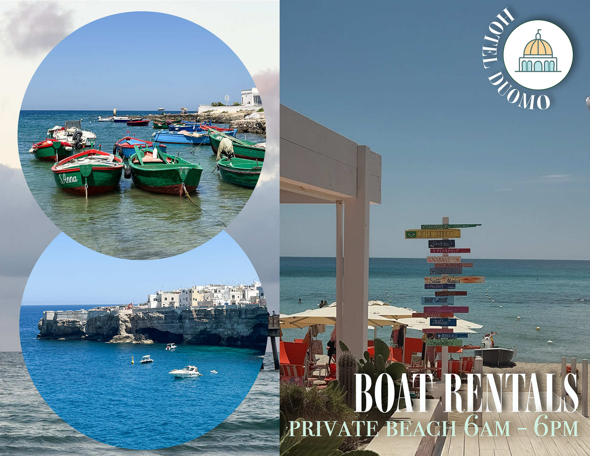
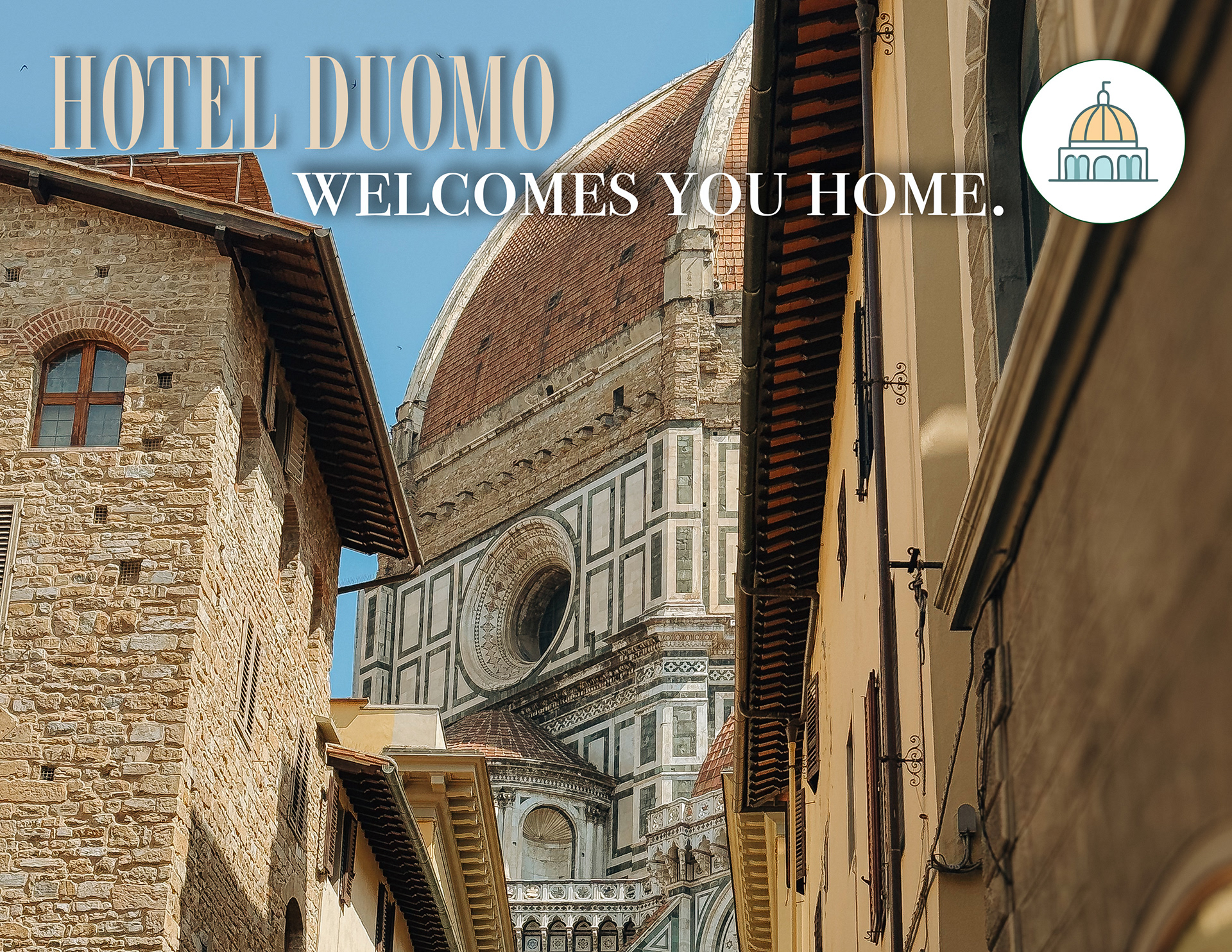
HOTEL BRANDING: hotel duomo
Medium: Adobe photoshop, lightroom, illustrator and indesign
i created a Hotel called hotel Duomo and developed branding elements as part of an advertising and informational Brochure.
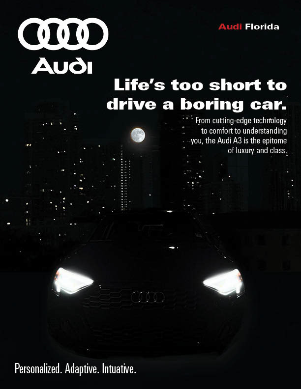
car branding: audi
Medium: Adobe photoshop and lightroom
I created A MOTOR VEHICLE advertisement for audi motors.
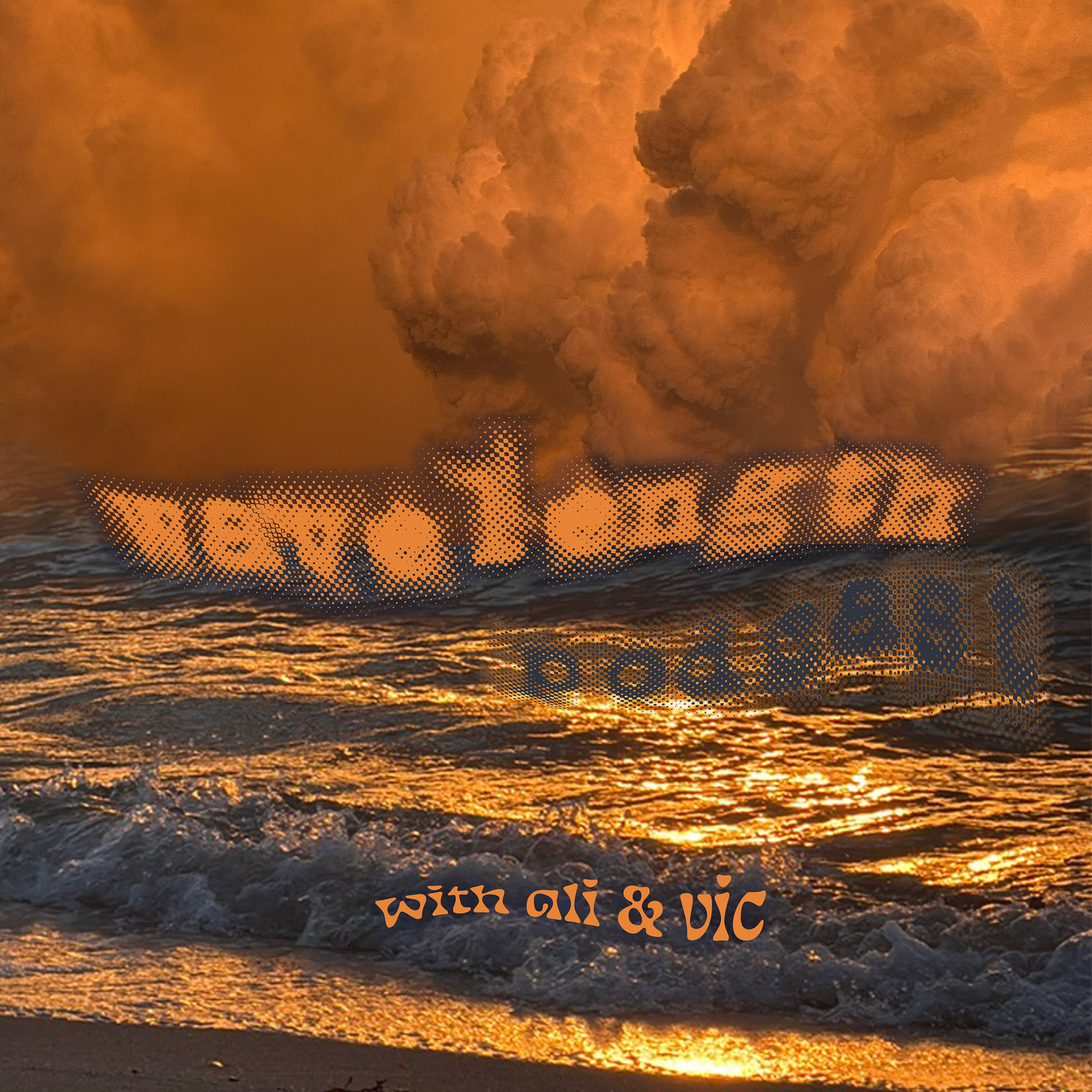
podcast cover art: wavelength
Medium: Adobe photoshop and lightroom
I created a podcast cover for a fictional podcast called wavelength.
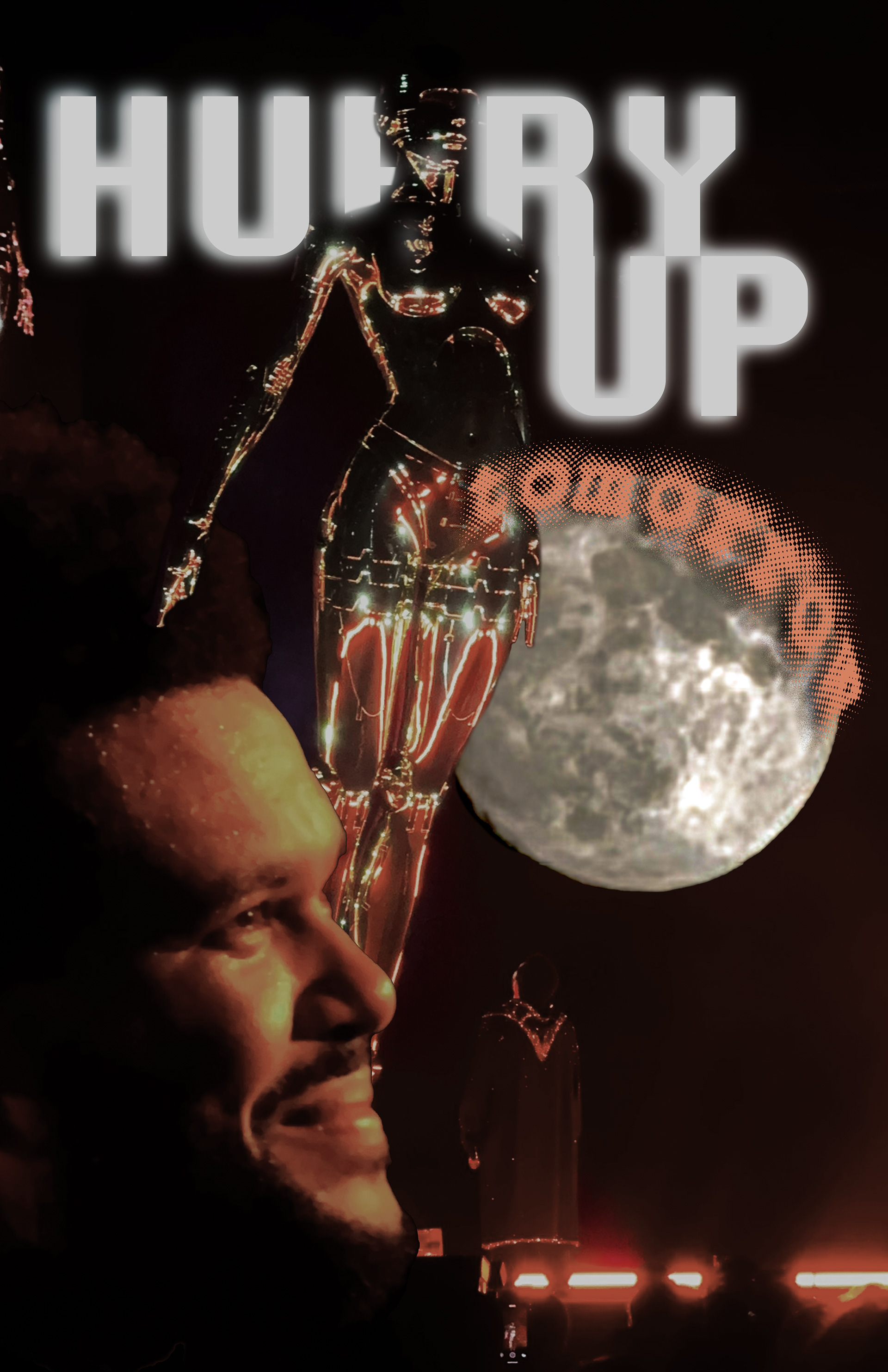
MOVIE POSTEr: hurry up tomorrow
Medium: Adobe photoshop and lightroom
I created a promotional Hurry Up Tomorrow (the weeknd's movie) movie poster utilizing photos i captured during The Weeknd concert.
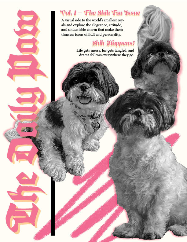
MAGAZINE COVER: The daily paw
Medium: Adobe photoshop and lightroom
I created a dog breed magazine called The Daily Paw and made it a Shih Tzu issue featuring my dog, Baby!
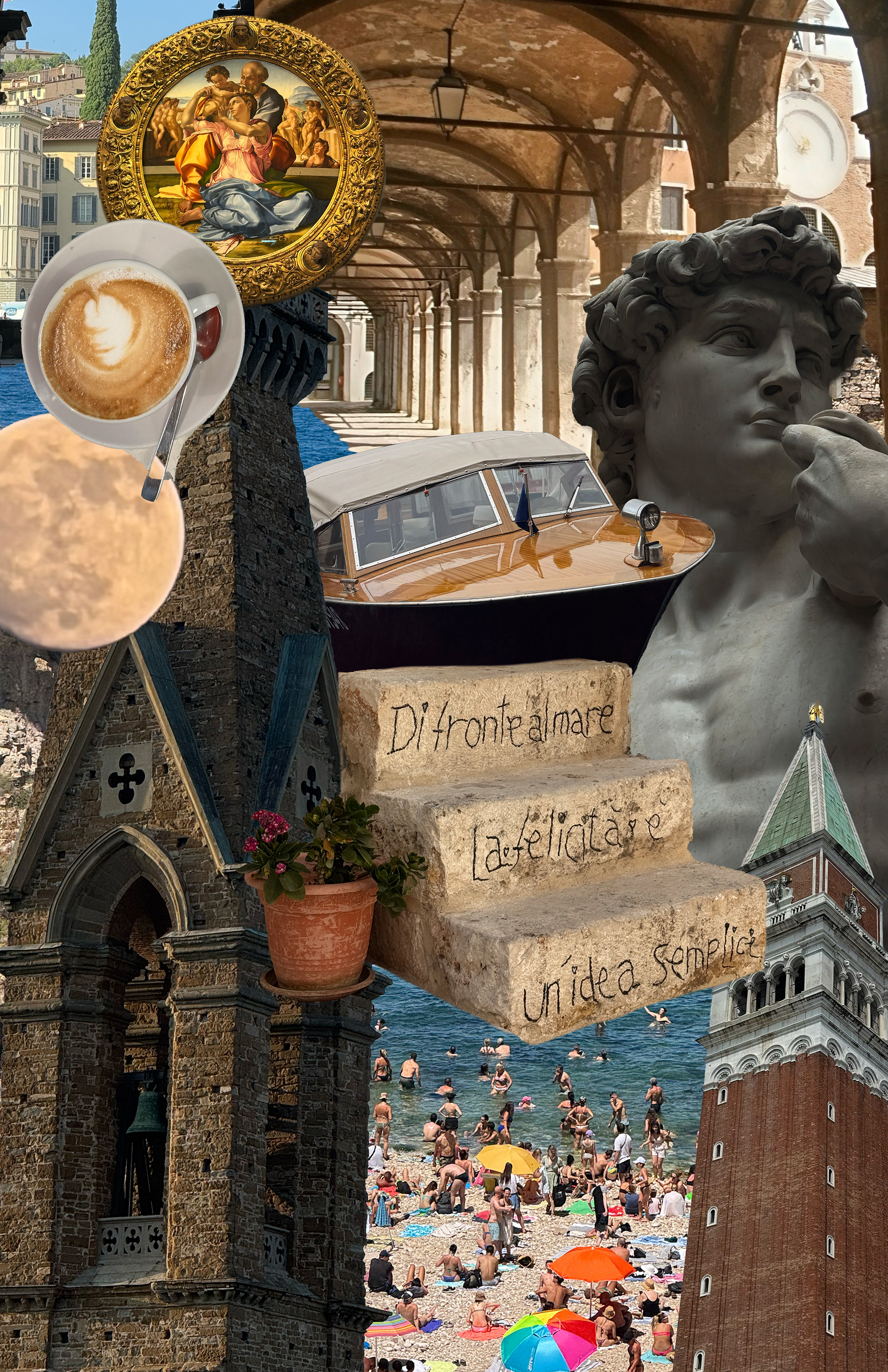
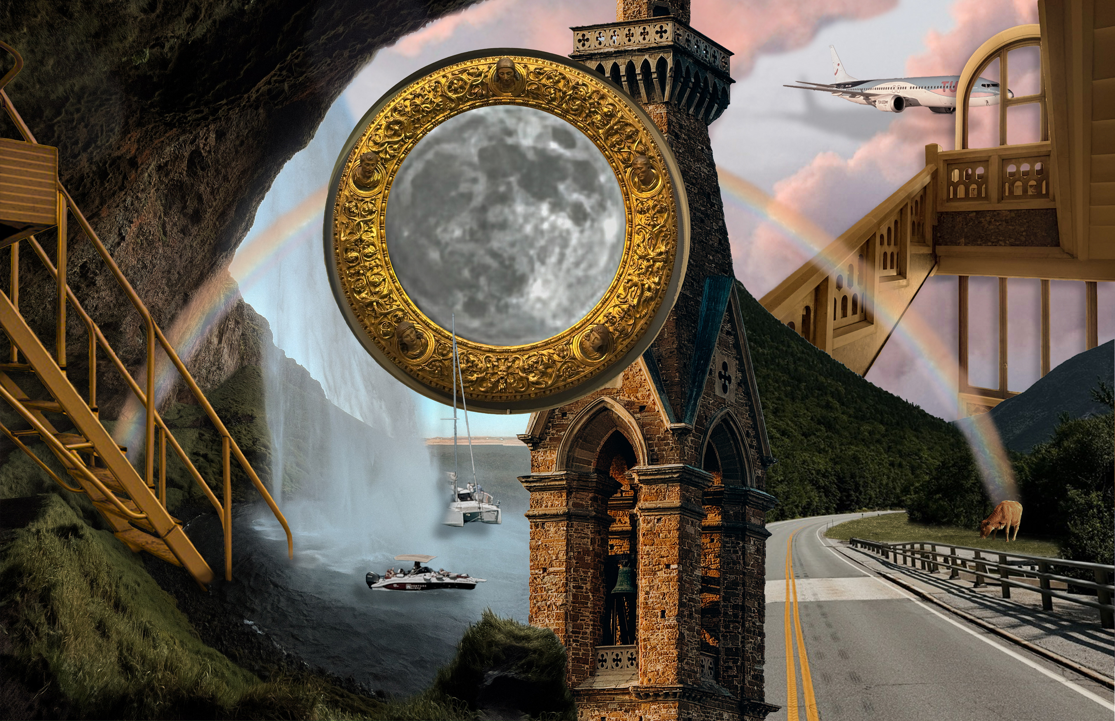
photo collage: italia 2025
Medium: Adobe photoshop and lightroom
I created A photo collage based on my trip to Italy IN summer OF 2025. I included Florence, Venice, and Puglia.